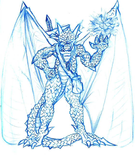
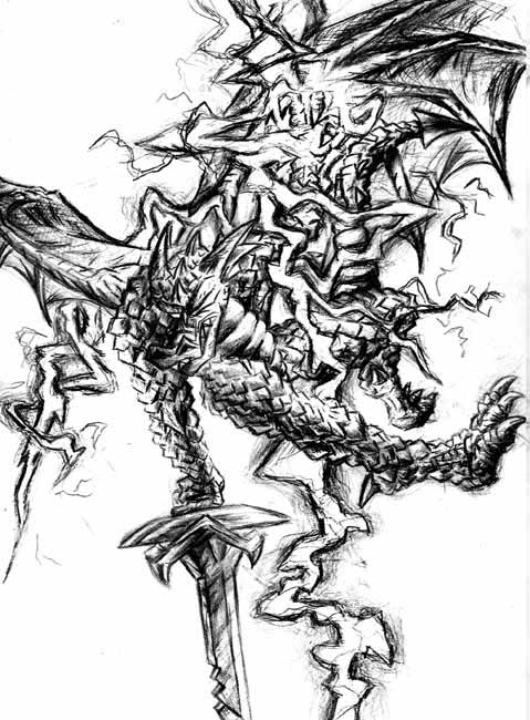
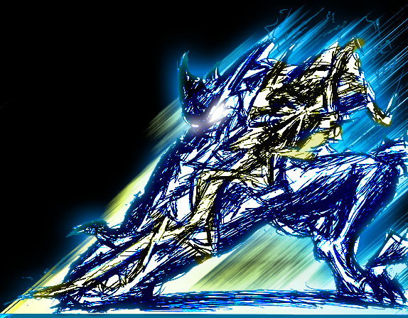
Everything on this page was actually made for a greater purpose. Like this one, was made to replace the OLD graphic I have on Fox's Main site. And yes, I WILL color this eventually. But I want to use Colored Pencils, not Photoshop. So, this is me detailing Fox out, and bringing him up to date. One of the rare pictures where he's complete! Wings, scales, and all he carries!
Fox Attack
All of this, including the logo way below, were for a shirt project I did up. Originally, I was thinking of a Red Shirt. and was ALWAYS thinking about that since I made her logo. I came up with the idea to have the logo on front, and the character detailed out, on back. Even though I changed it ALL at the last minute.
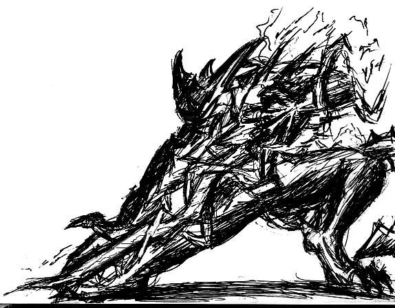
But I didn't have a super detailed Fox picture to use, so I had to make one. Since this was such a big project, I thought I'd show the steps I took, just for fun!
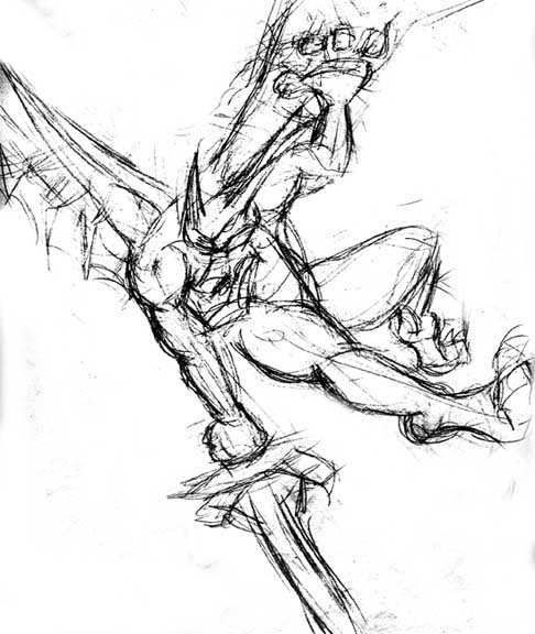
So I started with a super sketch fast 5-10 minute sketch, to get down the kind of pose I wanted. Work out all the main issues here first, before moving on to really clean it up.
Knowing I was going to be erasing A TON to get this right, I decided to try a new method, and it worked fantastic.
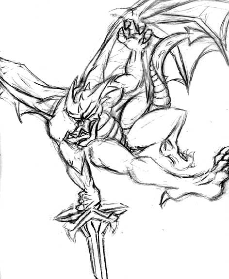
I scanned and reprinted out my super rough drawing above, and stuck it under my paper. From there, I traced over it but redrew it right, while doing that. This gave me a really clean version as well as saving me the wear on the paper, since I didn't erase on it much at all, yet.
I really like this drawing, and sadly you lose alot of the detail later, on the muscles and hands that I put in there.. ESPECIALLY the tail. You lose almost all that on the lower drawing. But thats something to work on.
A few reasons It becomes lost.
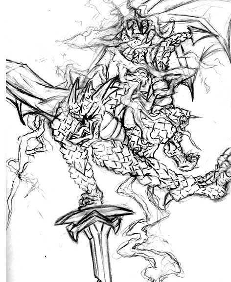
1. The scales. Adding all those everywhere, really breaks the muscles up. They don't stand out nearly as much. But they add a different kind of detail.
2. Isn't it obvious? It's the lightning! Too much craziness all over the place. I was trying to do something away from the typical "energy ball around my hand". And in that sense, it's a success. But it could still have been composed better so as not to cover up things.. like the tail. And be improved.. because it's pretty confusing to look at..
Now lets get dangerous. And no, not like Darkwing Duck.
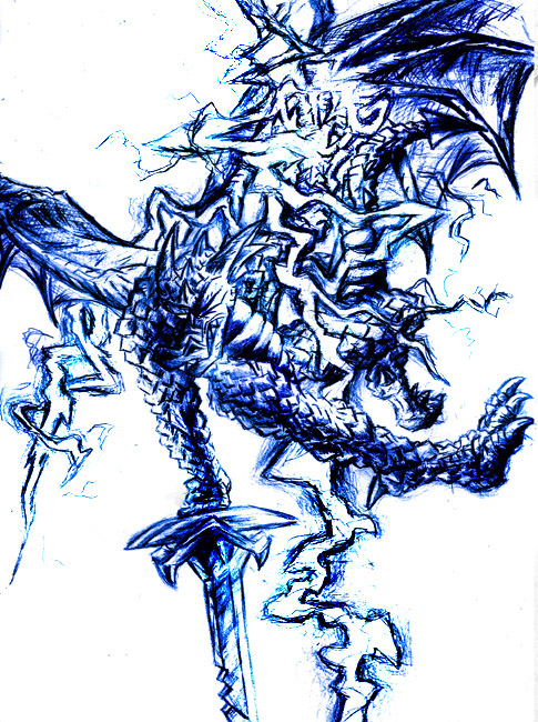
Shading is VERY dangerous. If you don't get it right, you can ruin the drawing. Or you might erase so much that you put a hole in the paper (been there, done that). It's also a very time consuming process, and if you're not happy with the end result.. it hurts.
My primary focus for this was to no matter WHAT, make sure the light source was the lightning. And man, doing all those scales to GET that, took forever. At least 5 or 6 hours. But I think I succeeded.
Lastly, pop that sucker into Photoshop and give it some color. I was originally planning to fully ink this, exactly like Red: Ground Zero, but without a background (because I couldn't think of one that wouldn't take away from the character). But then at the last second, I changed my mind because people told me the design was WAY too overkill for a shirt. >.< So i skipped the inking, and just went with a logo.
Total time drawing this? About 6 hours a day, in two days. So.. 12-ish hours. One weekend!
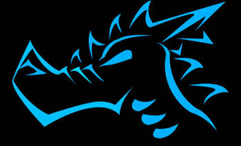
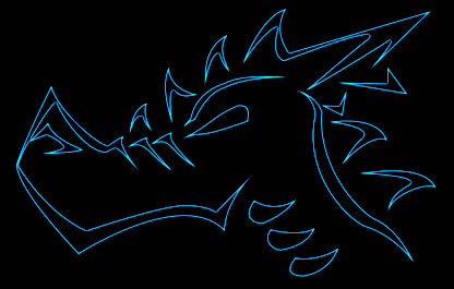
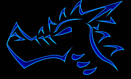
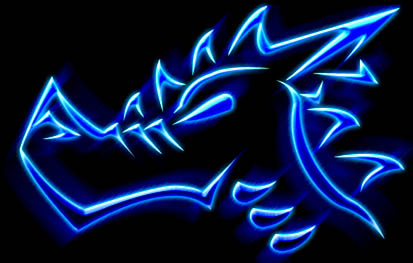
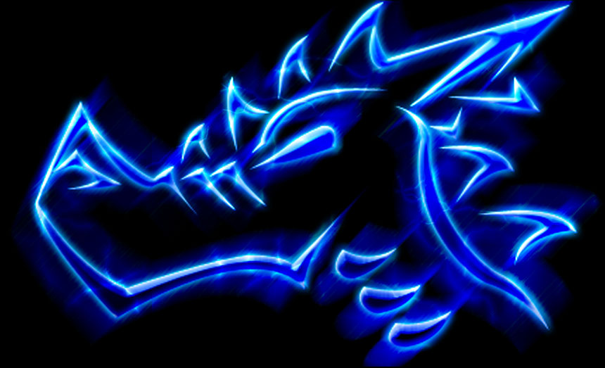
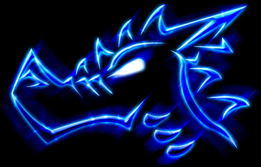
Fox Logo
Now before you ask, yeah.. I do plan to make logos for all my characters. I already have one in mind for Kain. I can SEE it in my head.. just as I type this.. Just gotta put it on paper.
But anyway, I drew this up awhile ago and then went into Photoshop exactly like the Red Logo and make it all clean and nice with paths.
From there, it was the long hard road of PICKING a design and STAYING with it. Originally I planned to use the the first solid blue one, but after I ditched the characters on the back.. I felt like I was copping out to use a logo so plain. So I went all overboard making some insane ones. Ironically, they ended up NOT being able to print the insane ones, and I basically went back to where I started! Oh well.
I really like this logo, when I made it.. the idea was to make it with shapes that could be lightning pieces, so nothing actually connects. Your eye fills in the blank spots. I bet until you really thought about it.. you wouldn't even NOTICE they don't link up!
But i used this on Xmas 2003 to make shirts for a whole ton of people! If by any chance you would like one, drop me a line and we'll talk.
Click to enlarge
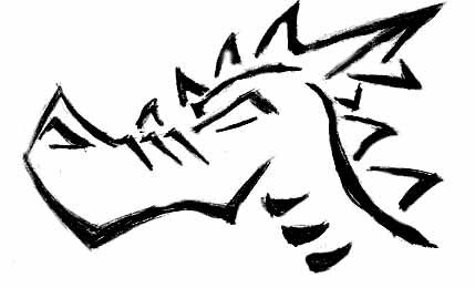
Crap.. wheres my pencil..?
Alright, I lied. These ones don't have ANYTHING higher planned for them. I just was on the bus, didn't have my pencil with me.. So I penned something up real fast (5-10 min) because I was in the mood to draw.
If you CAN'T tell, it's just Fox with a lightning bolt. Some of this turned out great, and other parts.. not so much. But hey, it's pen, what do you expect?
The first one is straight from the sketchbook. And the second, a 5-10 minute Photoshop coloring for the hell of it!